
 Getting Started
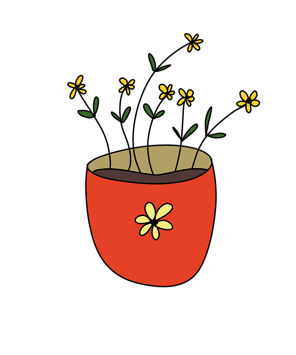
Content Heading
this is the body of content
Welcome to the our documentation! We allow you to make beautiful, modern, and fast websites/applications regardless of your design experience.

Get started by including production-ready CSS and JavaScript via CDN links without the need for any build steps.
index.html file in your project root. Include the
<meta name="viewport"> tag as well for proper responsive behavior in mobile
devices.
<!doctype html>
<html lang="en">
    <head>
        <meta charset="utf-8">
        <meta name="viewport" content="width=device-width, initial-scale=1">
        <tilte>UI-Component library demo </tilte>
    </head>
    <body>
        <h1>Hello world!</h1>
    </body>
</html><link> tag in the
<head></head> for our CSS, and the
<script></script> tag for our JavaScript bundle before the closing
</body>
<!doctype html>
<html lang="en">
    <head>
    <meta charset="utf-8">
    <meta name="viewport" content="width=device-width, initial-scale=1">
    <title>UI-Component library demo </title>
    <link href="https://ui-component-library-123.netlify.app/style/style/uiComponentLibrary.min.css" rel="stylesheet" >
</head>
<body>
    <h1>Hello  world!    </h1>
    <script src="https://ui-component-library-123.netlify.app/js/js/uiComponentLibrary.min.js" >  </script>
</body>
</html>To use all features, Just Add CDN link of CSS and JS in head tag of
index.html file. After adding CDN links Just search for your UI like navbar, button,
form etc in WebHelpUI components and Copy the HTML code given then add the code in your HTML file
where you want to add this UI.
<link rel="stylesheet" href="https://ui-component-library-123.netlify.app/style/style/uiComponentLibrary.min.css">
<script src="https://ui-component-library-123.netlify.app/js/js/uiComponentLibrary.min.js"></script>head tag<head>
<meta charset="UTF-8">
<meta http-equiv="X-UA-Compatible" content="IE=edge">
<meta name="viewport" content="width=device-width, initial-scale=1.0">
<link rel="stylesheet" href="https://ui-component-library-123.netlify.app/style/style/uiComponentLibrary.min.css ">
<script src="https://ui-component-library-123.netlify.app/js/js/uiComponentLibrary.min.js" ></script>
<title>Button-Preview</title>
</head><button id="btn-primary">Primary</button>
<button id="btn-secondary">Secondary</button>It is supported in all Browsers and all devices.
A great way to create a responsive design, is to use a responsive style sheet, like
uiComponentLibrary.use.css.
It make it easy to develop sites that look nice at any size!
All UI which you will use from these UI components is fully responsive and changes according to the screen size.
Let's Take an Exapmle of Navbar in Desktop and Mobile


We have devided all the devices into two categories based on their screen width.
width < 780px )780px < width < 980px ) width > 980px )Buttons are very important part of any website because buttons can link all the things and gives a good user experience.
Ui-Component-library provides different categories of buttons, you can pick any of them according to your requirement
These buttons are build with button tag and anchor tag so you can add
link
here also
<a href="#"><button class="btn btn-primary">Primary</button></a>
<a href="#"><button class="btn btn-secondary">Secondary</button></a>
<a href="#"><button class="btn btn-success">Success</button></a>
<a href="#"><button class="btn btn-danger">Danger</button></a>
<a href="#"><button class="btn btn-warning">Warning</button></a>
<a href="#"><button class="btn btn-info">Info</button></a>
<a href="#"><button class="btn btn-light">Light</button></a>
<a href="#"><button class="btn btn-dark">Dark</button></a>
<a href="#"><button class="btn btn-link">Link</button></a>These buttons are build with button tag and anchor tag so you can add
link
here. If you not need to add link in button then you can just remove anchor tag.
<a href="#"><button class="btn btn-outlined-primary">Primary</button></a>
<a href="#"><button class="btn btn-outlined-secondary">Secondary</button></a>
<a href="#"><button class="btn btn-outlined-success">Success</button></a>
<a href="#"><button class="btn btn-outlined-danger">Danger</button></a>
<a href="#"><button class="btn btn-outlined-warning">Warning</button></a>
<a href="#"><button class="btn btn-outlined-info">Info</button></a>
<a href="#"><button class="btn btn-outlined-light">Light</button></a>
<a href="#"><button class="btn btn-outlined-dark">Dark</button></a>
<a href="#"><button class="btn btn-outlined-link">Link</button></a>Some of Tag buttons will work with form so you can use Submit, Reset
button
to submit
the form or reset the
entered value in the form.
In the Link Button you can add Link of another page/url or any ID of your document
to
redirect there.
<button type="submit" class="btn btn-tags">Button</button>
<input type="reset" class="btn btn-tags" value="Reset">
<input type="button" class="btn btn-tags" value="Input">
<input type="submit" class="btn btn-tags" value="Submit">
<a href="#" class="btn btn-primary">Link</a>A card is a flexible and extensible content container. It includes options for headers and footers, a wide variety of content, contextual background colors, and powerful display options
Ui-Component-library provides different types of Cards, you can pick any of them
according to your
requirement. Just Add CDN Link in your head tag and copy-paste the HTML code then
you
will
get a card.
<div class="card-1">
    <div class="imgText">
        <div class="img">
            <img src="/image/card-img-1.png" alt="image">
        </div>
        <div class="text">
            <h2>Content Heading</h1>
            <p>this is the body of content</p>
        </div>
    </div>
    <div class="below">
        <a href="#">READ</a>
        <a href="#">BOOKMARK</a>
        <span>🤍</span>
        <span><img class="card-1-icon" src="/image/share-icon-card.svg" /></span>
        <span><img class="card-1-icon" src="/image/vertical-three-dot.png" /></span>
    </div>
</div><div class="card-2">
<div class="img">
<img src="/image/flower-card.jpg" alt="">
</div>
<div class="content">
<h2>Content Heading</h2>
<small>Sub Heading</small>
<p>This is the content paragraph.</p>
<span class="price">Rs. 999</span>
<span class="orgPrice">Rs.1099</span>
<span class="discount">10%</span>
</div>
<div class="card-2-btn"><a href="#"><img src="/image/cart-card.svg" />Add to
cart</a href="#"></div>
</div>
<div class="card-3">
    <div class="img">
        <img src="/image/image-card-3.jpg" alt="pic">
    </div>
    <div class="content">
        <h2>Content Heading</h2>
        <small>Sub Heading</small>
        <p>This is the content paragraph.</p>
    </div>
    <div class="card-3-btn"><a href="#">Go Somewhere</a href="#">
    </div>
</div>Navigation bar is used to navigate through the web apps or websites. This navigation component is responsive. It is a hamburger menu in Android devices.
Ui-Component-Library provides a responsive navbar which works in all devices like desktop, android and tablets etc.
<div class="navbar active">
    <div class="mobile-nav-btn mobile-nav-btn-right" onclick="mobileNavShow()">
        <ion-icon name="menu-outline" class="mobile-nav-icon "></ion-icon>
        <ion-icon name="close-outline" class="mobile-nav-icon "></ion-icon>
    </div>
    <div class="left-nav">
        <div class="logo">
            <img src="image/UI-LOGO-BLUE-final.png" alt="">
        </div>

        <div class="about">About</div>
        <div class="blog">Blog</div>
        <div class="blog">Contact Us</div>
        <div class="blog"><a href="documentation.html">Documentation</a></div>
    </div>
    <div class="right-nav">
        <div class="twitter"><img src="image/Twitter-logo.svg.png" alt=""></div>
        <div class="git-logo"><img src="image/git-logo-f.png" alt=""></div>
        <div class="dark-mode"><img src="image/dark-mode-logo.png" alt=""></div>
    </div>
</div>
Login Form is used to login for user account. Ui-Component-library provides login form
also you
can just add CDN link of CSS and JavaScript, copy-paste the below code
into your
document and you
will get a
very responsive and awesome Login form in your website. You can change the width of the form
using
className.
<div class="main_div">
    <div class="title">Login Form</div>
    <div class="social_icons">
        <a href="#"><i class="fab fa-facebook-f"></i> <span>Facebook</span></a>
        <a href="#" class="google"><i class="fab fa-google"></i><span>Gmail</span></a>
    </div>
    <form action="#">
        <div class="input_box">
            <input type="text" placeholder="Email or Phone" required>
            <div class="icon"><i class="fas fa-user"></i></div>
        </div>
        <div class="input_box">
            <input type="password" placeholder="Password" required>
            <div class="icon"><i class="fas fa-lock"></i></div>
        </div>
        <div class="option_div">
            <div class="check_box">
                <input type="checkbox">
                <span>Remember me</span>
            </div>
            <div class="forget_div">
                <a href="#">Forgot password?</a>
            </div>
        </div>
        <div class="input_box button">
            <input type="submit" value="Login">
        </div>
        <div class="sign_up">
            Not a member? <a href="#">Signup now</a>
        </div>
    </form>
</div><div class="login-container-1">
<form action="">
<h3>Log in</h3>
<div class="inputBox">
<span>Username</span>
<div class="box">
<div class="icon">
<img src="/image/user-icon.svg" alt="">
</div>
<input type="text" placeholder="username">
</div>
</div>
<div class="inputBox">
<span>Password</span>
<div class="box">
<div class="icon">
<img src="/image/lock-closed-icon.svg" alt="">
</div>
<input type="password" placeholder="password">
</div>
</div>
<label for="">
<input type="checkbox" name="" id=""> Remember me
</label>
<div class="inputBox">
<div class="box">
<input type="submit" value="Log in">
</div>
</div>
<div class="forget-pass">
<a href="#" class="forgot">Forget Password</a>
</div>
</form>
</div><form action="" class="login-container">
<h3>Login Panel</h3>
<input id="userName" type="text" placeholder="user name" required autocomplete="off">
<input id="password" type="password" placeholder="Password" required>
<button type="submit">Submit</button>
<div class="result"></div>
<p>⭐ Length of Password Should be atleast 8</p>
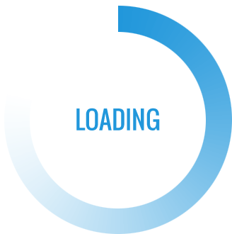
</form>Loader activates when the page is loading and is shows a loading effect on website
Ui-Component-library provides different types of Loader, You can use this by just adding CSS and
JS CDN
Link into your document.
Place the JavaScript Link at the end of body tag.
<div class="whi-loader">
    <img src="/image/loader-5.gif" alt="">
</div>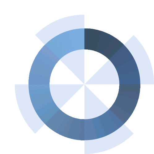
<div class="whi-loader">
    <img src="/image/loader-6.gif" alt="">
</div>
<div class="whi-loader">
    <img src="/image/loader-7.gif" alt="">
</div>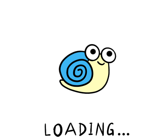
<div class="whi-loader">
    <img src="/image/loader-3.gif" alt="">
</div>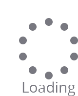
<div class="whi-loader">
    <img src="/image/loader-4.gif" alt="">
</div>
<div class="whi-loader">
    <img src="/image/loader.gif" alt="">
</div>
<div class="whi-loader">
    <img src="/image/loader-2.gif" alt="">
</div>
<div class="whi-loader">
    <img src="/image/loader-8.gif" alt="">
</div>A progress bar can be used to show a user how far along he/she is in a process.
A default progress bar in Ui-Component-Library looks like this:
To create a default progress bar, add a .progress class to a <div>
element:
<div class="progress">
    <div class="progress-bar" role="progressbar" aria-valuenow="70"
    aria-valuemin="0" aria-valuemax="100" style="width:70%">
        <span class="sr-only">70% Complete</span>
    </div>
</div>A progress bar with a label looks like this:
Remove the .sr-only class from the progress bar to show a visible percentage:
<div class="progress">
    <div class="progress-bar" role="progressbar" aria-valuenow="70"
    aria-valuemin="0" aria-valuemax="100" style="width:70%">
        70%
    </div>
</div>Contextual classes are used to provide "meaning through colors".
The contextual classes that can be used with progress bars are:
.progress-bar-success.progress-bar-info.progress-bar-warning.progress-bar-dangerThe following example shows how to create progress bars with the different contextual classes:
<div class="progress">
    <div class="progress-bar progress-bar-success" role="progressbar" aria-valuenow="40"
    aria-valuemin="0" aria-valuemax="100" style="width:40%">
        40% Complete (success)
    </div>
</div>

<div class="progress">
    <div class="progress-bar progress-bar-info" role="progressbar" aria-valuenow="50"
    aria-valuemin="0" aria-valuemax="100" style="width:50%">
        50% Complete (info)
    </div>
</div>

<div class="progress">
    <div class="progress-bar progress-bar-warning" role="progressbar" aria-valuenow="60"
    aria-valuemin="0" aria-valuemax="100" style="width:60%">
        60% Complete (warning)
    </div>
</div>

<div class="progress">
    <div class="progress-bar progress-bar-danger" role="progressbar" aria-valuenow="70"
    aria-valuemin="0" aria-valuemax="100" style="width:70%">
        70% Complete (danger)
    </div>
</div>Progress bars can also be striped:
Add class .progress-bar-striped to add stripes to the progress bars:
<div class="progress">
    <div class="progress-bar progress-bar-success progress-bar-striped" role="progressbar"
    aria-valuenow="40" aria-valuemin="0" aria-valuemax="100" style="width:40%">
        40% Complete (success)
    </div>
</div>

<div class="progress">
    <div class="progress-bar progress-bar-info progress-bar-striped" role="progressbar"
    aria-valuenow="50" aria-valuemin="0" aria-valuemax="100" style="width:50%">
        50% Complete (info)
    </div>
</div>

<div class="progress">
    <div class="progress-bar progress-bar-warning progress-bar-striped" role="progressbar"
    aria-valuenow="60" aria-valuemin="0" aria-valuemax="100" style="width:60%">
        60% Complete (warning)
    </div>
</div>

<div class="progress">
    <div class="progress-bar progress-bar-danger progress-bar-striped" role="progressbar"
    aria-valuenow="70" aria-valuemin="0" aria-valuemax="100" style="width:70%">
        70% Complete (danger)
    </div>
</div>Add class .active to animate the progress bar:
<div class="progress">
    <div class="progress-bar progress-bar-striped active" role="progressbar"
    aria-valuenow="40" aria-valuemin="0" aria-valuemax="100" style="width:40%">
        40%
    </div>
</div>Progress bars can also be stacked:
Create a stacked progress bar by placing multiple bars into the same <div class="progress"> :
<div class="progress">
    <div class="progress-bar progress-bar-success" role="progressbar" style="width:40%">
        Free Space
    </div>
    <div class="progress-bar progress-bar-warning" role="progressbar" style="width:10%">
        Warning
    </div>
    <div class="progress-bar progress-bar-danger" role="progressbar" style="width:20%">
        Danger
    </div>
</div>
Alerts are created with the .alert class, followed by one of the four contextual classes .alert-success, .alert-info, .alert-warning or .alert-danger:
<div class="alert alert-success">
    <strong>Success!</strong> Indicates a successful or positive action.
</div>

<div class="alert alert-info">
    <strong>Info!</strong> Indicates a neutral informative change or action.
</div>

<div class="alert alert-warning">
    <strong>Warning!</strong> Indicates a warning that might need attention.
</div>

<div class="alert alert-danger">
    <strong>Danger!</strong> Indicates a dangerous or potentially negative action.
</div>
Avatars gives good User Experience on the website, it can be used to show user/admin profile or logo in the Navbar.
UI-Component-Library provides different types of Avatars based on the size and design, you can pick any of them according to your requirement.
Circular Avatar can be used to show user profile or company logo. You can change the image also.
You can use this design by adding a class name
"crl-avatar-box" and use any size by adding class names ".avatar-lg",
"avatar-mdl1","avatar-mdl2","avatar-sml1","avatar-sml2".
You can also give custon size and style by using these class names using !important
keyword
Squre avatar can be used to show user profile or company logo. You can change the image also.
You can use this design by adding a class name
"squre-avatar-box" and use any size by adding class names ".avatar-lg",
"avatar-mdl1","avatar-mdl2","avatar-sml1","avatar-sml2".
You can also give custon size and style by using these class names using !important
keyword
Badge are used to show notification or status.
UI-Component-Library provides different types of Badge based on the design, you can pick any of them according to your requirement. These alerts are :
It will show the status of Profile.
It will show the status of Heading on your website.
It will show the status of Link on your website.
It will show the status of button on your website.
It will show the status of Profile or Inbox on your website.
This component can be used for toast or snackbar component. Snackbar is to used show message that need user action
You can use snackbar to show notifications and error,sucess and warn messages.
UI-Component UI-Component-Library provides different types of snackbars based on the situation, you can pick any of them according to your requirement.


 Add to
cart
Add to
cart